
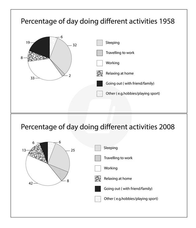
The pie charts give information about how the workers spend their time in various activities in a particular country in a half a century.
Overall
, it is clear the work was still the largest segment in the two charts with an increase in it. accompanied by increasing in it all.
Linking Words
Firstly
, the majority of the time every 2 years goes to the top 2 where are working and sleeping were 33% and 32% in 1958. Linking Words
Hence
, working had slight growth of 42%. Linking Words
on the
Linking Words
contrary
decreased the rate of sleeping by about 7% in 2008.
Add a comma
,contrary
Additionally
,increases in other for details, travel to work from 2% upward to fourfold in 2008.Linking Words
Moreover
, relaxing at home and playing sports or other those figures rose to 13% and 8% respectively ( from 8% and 6%). Linking Words
otherwise
, going out accounted for 19% in 1958 fell to 6% Linking Words
at the end
of the period and hit the low point.Linking Words