
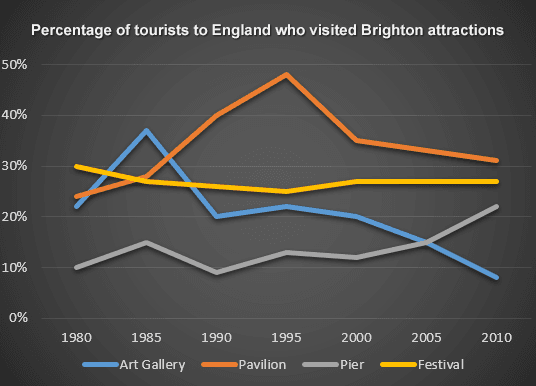
The line graph indicates the number of tourists visiting Brighton attractions in England between 1980 and 2010.
From an
overall
perspective, Linking Words
it is clear that
the pavilion and pier experienced an upward trend, Linking Words
whereas
the opposite was true for the Art Gallery. Meanwhile, the figure for the festival remained stable with a minor decline.
After 1980, the percentage of tourists visiting the pavilion increased dramatically by around 10% every 5 years until it reached a peak of 48% in 1995. Linking Words
Although
the number dropped significantly by 15% in 2000, it remained the most popular attraction with 30% of tourists by the end of the period. At the same time, pier, which started with the smallest percentage in 1980 (10), fluctuated till the year 2000, after which gradually climbed to 22% in 2010.
With regards to the Art gallery, it increased dramatically after 1980 and reached a peak in 1985. Linking Words
However
, the figure dropped back to 20% in 1980 and moved downward to 9% by 2010, becoming the least visited attraction. Linking Words
While
the festival started as the most attractive place at the beginning of the given time period, the number dropped slightly to 25% in 1995 and recovered to 28% in 2000, after which it remained constant.Linking Words