
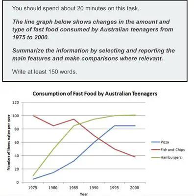
The line graph illustrates the food consumption of pizza, fish and chips and hamburgers in Australia by teenagers from 1950 to 2010.
Overall
, whilst fish and chips consumption declined over the Linking Words
years
, the amount of hamburger and pizza eaters rose. Use synonyms
Moreover
, the food preference over time inverted, Linking Words
although
fish and chips began at 100 in 1975, afterwards plummeted to a low around 40. Linking Words
Whereas
the other two foods had an opposite growth pattern, starting with just above 0 and rocking beyond 80 in 2020.
Linking Words
Furthermore
, the preference among teenagers for pizzas and burgers surge over the Linking Words
years
, reaching its peak in 1995 and 1985, respectively. Use synonyms
Subsequently
, the maximum number of consumers hamburgers slightly increased during the next Linking Words
years
Use synonyms
while
pizza consumption remained steady. Linking Words
In addition
, the younger population ate roughly twenty times per year more burgers than pizzas in 2000.
Linking Words
Additionally
, between 1975 and 1985 the quantity eaten per year by younger people of the traditional British dish fluctuated and just after plunged reaching as low as 38 approximately in 2000.
In conclusion, the type of food most consumed by teenagers in Australia changed in 15 Linking Words
years
.Use synonyms