
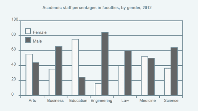
The bar chart illustrates the proportion of man and female staff who work per university faculty during 2012.
Overall
, we can see that Linking Words
while
education has the highest percentage of women employed, engineering is the most common field for men.
Looking at the graph, arts and education are dominated by female staff. It is interesting to see that the number of women teaching education is much higher than men, with 72% and 25% respectively. Female teachers are more common in arts, Linking Words
although
, the gap between the number of males and females is smaller.
Linking Words
On the other hand
, male-dominated fields of teaching include engineering, business, law and science. In fact, these figures almost doubled the female ones by 20-30% each. Linking Words
However
, the most dramatic difference occurred in the engineering sector whose percentage of male staff is 85%, Linking Words
while
the female part only accounts for 18%.Linking Words