
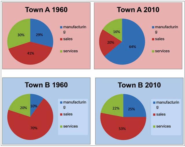
The pie chart depicts the number of working candidates in different departments in the years 1960 and 2010 in Town A.
Overall
, the manufacturing department stands out with the increase in the percentage of workers comparatively between the years. And Linking Words
in contrast
, the other two sectors have seen their downside in the year 2010 from 1960.
Linking Words
To begin
with, a large number of people preferred to work in 1960 in the service department with a percentage of 41 and Linking Words
in contrast
, It has decreased by almost more than half the percentage in 2010 to 20%. Linking Words
Similarly
, the manufacturing department Linking Words
also
showed some promise at the beginning, but people tend to lose interest in Linking Words
this
field too, with a number of only 16% in 2010.
Next, manufacturing is unique when compared to the other two sectors. Linking Words
That is
to say, it is the only sector which is not as popular as services in 1960 with adults preferring only 29%. But Linking Words
due to
large development in recent years, more than half the people are working in the manufacturing section with a significant rise to 64% which is three times more than sales and services.Linking Words