
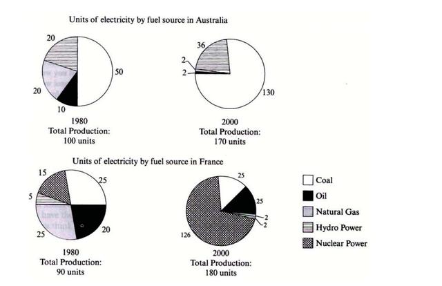
The given pie charts give information about the percentage of
electricity
generated by five different resources in two countries during 1980 and 2000.
Use synonyms
Overall
, we can see that Linking Words
Australia
used coal as its major source of Use synonyms
electricity
in both years, Use synonyms
whereas
Linking Words
France
used more nuclear power sources in 2000. Use synonyms
In addition
, the total production of Linking Words
electricity
grew for both countries over the years.
In 1980, 50 Use synonyms
units
of Use synonyms
electricity
were produced by coal, and Use synonyms
this
figure rapidly increased to 130 Linking Words
units
in just twenty years. Use synonyms
On the contrary
, in Linking Words
France
, only 25 Use synonyms
units
were generated Use synonyms
in
each year. Change preposition
apply
Moreover
, hydropower accounted for 20 and 36 Linking Words
units
in Use synonyms
Australia
, Use synonyms
while
Linking Words
France
produced only 5 and 2 Use synonyms
units
each year.
It is noticeable that the production of Use synonyms
electricity
by using natural gas was reduced from 20 to 2 Use synonyms
units
in Use synonyms
Australia
. Use synonyms
Likewise
, Linking Words
France
's natural resources declined significantly from 25 to 2 Use synonyms
units
. Use synonyms
While
oil usage decreased rapidly from 10 to 2 Linking Words
units
in Use synonyms
Australia
, Use synonyms
on the other hand
, Linking Words
this
figure rose slowly in Linking Words
France
(from 20 to 25 Use synonyms
units
).Use synonyms