The charts show projections for global production by sector in 2040 and 2060. Summarise the information by selecting and reporting the main features, and make comparisons where relevant.

The charts show projections for global production by sector in 2040 and 2060.

Summarise the information by selecting and reporting the main features, and make comparisons where relevant.
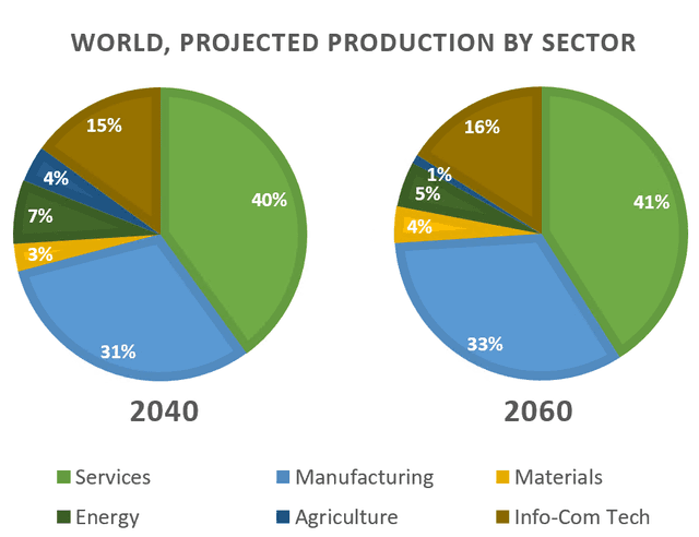
The pie charts compare the proportion of the diverse job between 2040 and 2060.
It is clear that
most people choose to engage in the services industry over a given period. It is
also
obvious that there are slight changes in different job sectors. In 2030, 40% of the population work in the services sector,
while
the next most popular jobs are manufacturing(31%) and Info-Com Tech(15%).
By contrast
, less than 8% of residents have jobs in energy, materials and agriculture fields. Over the following two decades, there is a minimal rise in the figure for the top three employment opportunities, and a relatively sharp increase in materials, with the figure climbing from 3% to 4% .
However
, the percentage of people working in energy and agriculture experience a significant drop, which reaches 5% and 1% respectively.
Submitted by clairelee890201 on

Unauthorized use and/or duplication of this material without express and written permission from this site’s author and/or owner is strictly prohibited. Excerpts and links may be used, provided that full and clear credit is given to Writing9 with appropriate and specific direction to the original content.

Sentences: Add more complex sentences.
Common mistake: Your writing should be 150-250 words.
Basic structure: Change the second paragraph.
Vocabulary: The word "figure" was used 2 times.
Vocabulary: Use several vocabularies to present the data in the second paragraph.
What to do next:
Look at other essays: