
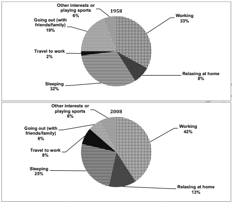
The pie charts provide information about the time spent on various activities by working professionals in a country during the years 1958 and 2008.
Overall
, it can be observed that even though the percentage of time spent on a job is different in both years, it is still the most performed activity by the population. Linking Words
Although
, the minimum preferred activities are travelling for work and going out with peers in 1958 and 2008, respectively.
In 1958, an almost similar proportion of adults focussed on both working and sleeping which was a bit more than one-third. Linking Words
Moreover
, approximately one-third preferred going out with friends and family to playing sports or relaxing at home. Travelling to work was the least favoured activity.
Linking Words
However
, the situation changed in 2008 when just over two-fifth of the professionals went to work. But as compared to the year 1958, over one-fifth of the individuals preferred sleeping Linking Words
as well as
13% relaxed at home. Activities like travelling, meeting peers and other interests like sports took the least spots of less than or equal to 8% each.Linking Words