
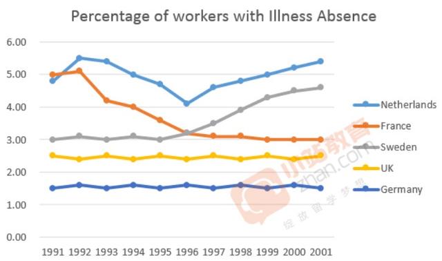
The supplied graph provides information about the number of employees in 5 countries located in Europe, who were absent
due to
illness between 1991 and 2001. The data is calibrated in percentage.
From an Linking Words
overall
perspective, it can be seen that Netherlands’ figure fluctuated whilst the Uk and German ones remain relatively steady. France's figure fell Linking Words
whereas
Sweden’s experienced an upward trend.
Getting back to details, The Netherlands workers started the period with just under 5%, Linking Words
then
unscrews slightly before suffering a dramatic decrease and Linking Words
then
went back again to around 5,4%. France's date was exactly 5% and Linking Words
then
in the next 8 years saw declined constantly and Linking Words
then
remained the same Linking Words
while
Sweden’s graph experienced a significant rose after 1995 and reached a peak in 2009 with 4,5% of sick workers roughly.
In terms of the UK and Germany, their graphs did not show great changes over the period and their value was around 2,5% and 1,5% respectively.Linking Words