
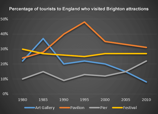
the line graph illustrates the demonstration of tourists who visited four different attractions (Art gallery, Pier,
Pavilion
, and Festival) from 1980 to 2010 in Brighton, UK.
Use synonyms
Overall
, the four popular attractions shared different trends Linking Words
according to
the time period. The Linking Words
pavilion
was the most popular place in Brighton, Use synonyms
while
the pier took Linking Words
last
place.
In the beginning, the Linking Words
percentage
of tourists who visited the Use synonyms
pavilion
was around 20 and it peaked at 50% in 1915. Use synonyms
Then
, it dropped almost a quarter to 30% in 2010. Linking Words
In addition
, the proportion of people in art galleries starts at 20%, which was third place in 1985 before it became the leader in 1985 with 40%.
After all, it declined to lower than 10% from 1990 to 2010.
Linking Words
On the other hand
, the Festival shared the highest Linking Words
percentage
of 30 at the beginning of the data and equally shared the same Use synonyms
percentage
of tourists who visited the Use synonyms
pavilion
at 30% in 1985. Use synonyms
Then
, it remained stable for over 20 years. Linking Words
Nonetheless
, the Linking Words
percentage
of pier visitors fluctuated from 10% to 15% every 5 years and rose steadily to 20% Use synonyms
at the end
of 2010.Linking Words