The tree pie charts below show the change in annual spending by a particular UK school in 1981, 1991 and 2001. Summarise the information by selecting and reporting the main features, and make comparisons where relevant.

The tree pie charts below show the change in annual spending by a particular UK school in 1981, 1991 and 2001.

Summarise the information by selecting and reporting the main features, and make comparisons where relevant.
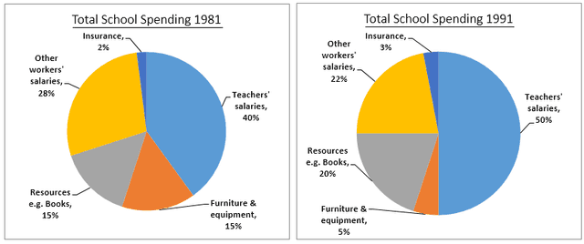
The pie charts are illustrating how much money
did
Unnecessary verb
apply
show examples
a particular school in the United Kingdom spent per year for the
years
of
Change preposition
apply
show examples
1981, 1991 and 2001. Units are measured in percentages.
Overall
, it can be seen that the biggest part of the resources
were
Change the verb form
was
show examples
invested in
teacher's
Fix the agreement mistake
teachers'
show examples
salaries in all of the
years
. Spending for things like books and physical improvements varied with time and insurance was the lowest expenditure for all of the
years
. Paying their educational staff was the biggest spending in all three
years
(40% in 1981, 45% in 2001 and a peak of 50% in 1991). Insurance
payment
Fix the agreement mistake
payments
show examples
fluctuated between 2% in the first year and slightly raised
at
Change preposition
to
show examples
8% in the
last
year, but it still was the smallest part of the budget. Other workers' salaries percentage decreased through the
years
(28%, 22% and 15% respectively). Other things like resources and furniture and equipment varied between 9% and 23%
,
Remove the comma
apply
show examples
but yet remained in the middle of the chart fraction.
Submitted by delulcheva on

Unauthorized use and/or duplication of this material without express and written permission from this site’s author and/or owner is strictly prohibited. Excerpts and links may be used, provided that full and clear credit is given to Writing9 with appropriate and specific direction to the original content.

Introduction: The introduction is missing.
Introduction: Change the first sentence in the introduction.
Introduction: The chart intro is missing.
Vocabulary: Replace the words years with synonyms.
Vocabulary: Only 6 basic words for charts were used.
Vocabulary: The word "charts" was used 2 times.
Vocabulary: The word "percentages" was used 2 times.
Vocabulary: Use several vocabularies to present the data in the second paragraph.
What to do next:
Look at other essays: