The graph below shows female unemployment rates in each country of the United Kingdom in 2013 and 2014. Summarise the information by selecting and reporting the main features, and make comparisons where relevant.

The graph below shows female unemployment rates in each country of the United Kingdom in 2013 and 2014.

Summarise the information by selecting and reporting the main features, and make comparisons where relevant.
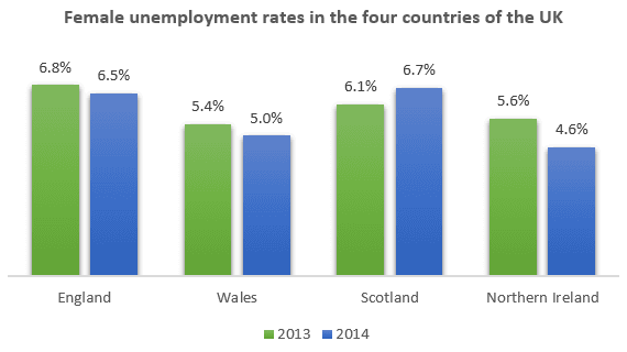
The illustration represents information female of jobless in the United Kingdom. At a
glance
Add a comma
,glance
show examples
we can grasp that in the first picture, England has
a
Remove the article
apply
show examples
more female
unemployment
than other countries. In Wales, everything is in perfect order, it doesn't have many
joblessness
Replace the word
jobless
show examples
women. What pleases me
.
Change the punctuation
?
show examples
Scotland has quite a lot of nonemployment women, in 2013 it was 6.1% and in 2014 it increased by 0.6%. Northern Ireland had 5.6% in 2013, after which the percentage of
unemployment
Replace the word
unemployed
show examples
women decreased by 1% in 2014. England
has
Wrong verb form
had
show examples
the highest female
unemployment
rate in 2013 than Wales, Wales has the lowest female
unemployment
rate in 2013. The lowest
unemployment
rate in 2014
is
Correct your spelling
in
show examples
Northern Ireland
,
Remove the comma
apply
show examples
and the highest in 2014
is
Correct your spelling
in
show examples
Scotland as a whole not
bad
Correct article usage
a bad
show examples
ending
Submitted by dnm.best on

Unauthorized use and/or duplication of this material without express and written permission from this site’s author and/or owner is strictly prohibited. Excerpts and links may be used, provided that full and clear credit is given to Writing9 with appropriate and specific direction to the original content.

Sentences: Add more complex sentences.
Linking words: Add some linking words.
Linking words: Add linking words.
Introduction: The introduction is missing.
Introduction: The chart intro is missing.
Common mistake: Your writing should be 150-250 words.
Basic structure: Change the fourth paragraph.
Introduction: The chart intro is missing.
Vocabulary: Replace the words unemployment with synonyms.
Vocabulary: Rephrase the word "information" in your introduction.
Vocabulary: Only 5 basic words for charts were used.
Vocabulary: Use several vocabularies to present the data in the fourth paragraph.
What to do next:
Look at other essays: