
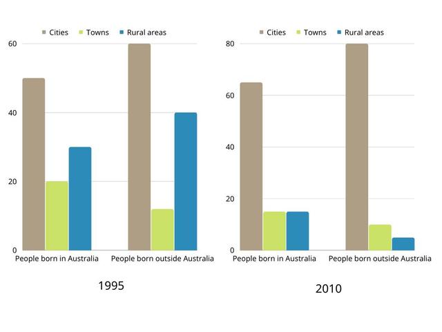
The charts provide information on the residency of people who were born in Australia and overseas in three different spaces over a fifteen-year period.
Overall
, the majority of people from both groups lived in the cities from 1995 to 2010.
Looking at the graph, in 1995, we can see that the results were very similar as the two groups mostly chose to live in the city, with 60% of immigrants and around 50% of Australian born. Interestingly, in the same year, both groups Linking Words
also
preferred to reside in rural towns, with 40% of overseas residents and about 30% of the citizens. Linking Words
Nonetheless
, even though towns were the least favourite place to reside, we can see more Australians than their counterpart, with 20% and around 10%, respectively.
Linking Words
Furthermore
, in 2010, it showed significant gaps between city residents from the other areas in those two categories. Linking Words
Firstly
, 80% of foreigners and approximately 65% of locals chose to settle in cities. Meanwhile, only approximately 5-10% of foreigners preferred to reside in other areas. Notably, there was the same number of people who wanted to settle in towns and rural, at about 15%.Linking Words