
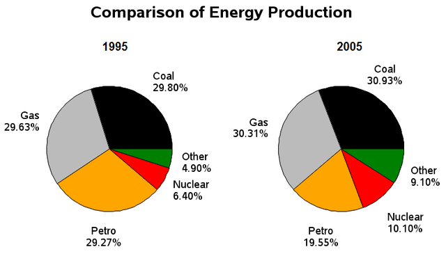
The two given
pie
charts compare the 5 different types of categories including coal, gas , petrol, nuclear and other which is electric production in France from 1985 to 2005. Units are measured in percentage.
It is noticeable that the proportion of gas , nuclear ,coal and other saw a considerable rise Use synonyms
while
Peter was the only Linking Words
pie
which experienced a small decrease over the given period . (71)
In 1985, 29,63 per cent of the average energy factor went on gas which was the largest Use synonyms
pie
chart Use synonyms
however
by 2005 Linking Words
this
figure had a significantly higher percentage of 30,31% . During 20 years coal which was the main factor of energy experienced a 1,13 per cent increase from 29,30% to 30,93%. Nuclear and other Linking Words
also
saw a considerable rise from 6.40%to 10.10% and from 4.50% to 9.10% respectively. Petro was the only Linking Words
pie
which experienced a considerable decrease over the given period from 29,27% to 19,55%Use synonyms