The pie chart below depicts energy generation by fuel type in the UK in two years. Summarise the information by selecting and reporting the main features, and make comparisons where relevant.

The pie chart below depicts energy generation by fuel type in the UK in two years.

Summarise the information by selecting and reporting the main features, and make comparisons where relevant.
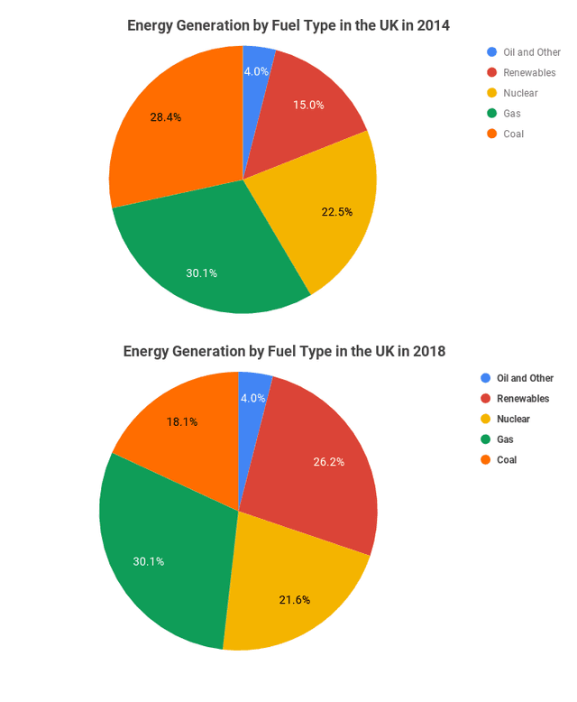
The par illustrates different types of energy generation in the UK , for ,example oil and other, Renewables, Nuclear, Gas and Coal from 2014 to 2018. The categories are a variety of them.
Overall
,
it is clear that
Gas is the same proportion remained from 2014 to 218 with 30.1% , and
also
, Oil and others stalled by 4.0 % .
However
, Renewables increased by about 10 %. Looking at the information in more detail, we can see in 2014, Coal was only 28.4%,
while
, in 2018, it declined to 18,1%. Nuclear was around 22.5% in 2014.
Whereas
, in 2018, it slightly rose by 21,6%. Over
this
period, gas stayed at 30.1%.
In addition
, Oil and other to 4%. Coal is the best one of these until 4 years.
Submitted by alqanubizakiya on

Unauthorized use and/or duplication of this material without express and written permission from this site’s author and/or owner is strictly prohibited. Excerpts and links may be used, provided that full and clear credit is given to Writing9 with appropriate and specific direction to the original content.

Sentences: Add more complex sentences.
Introduction: The introduction is missing.
Introduction: The chart intro is missing.
Common mistake: Your writing should be 150-250 words.
Introduction: The chart intro is missing.
What to do next:
Look at other essays: