
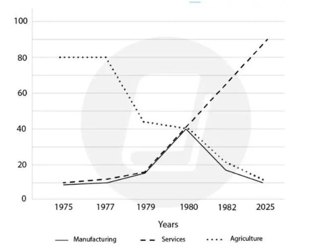
The line graph graph depicts the number of employment trends in the USA over 70 years; in a variety of work which are A agriculture, Manufacturing and we can observe that, the figure of people who work in Agriculture is to compared with other careers,
services
.
Use synonyms
overall
, that clearly can be seen the percentage of employees in Linking Words
services
and Manufacturing are the two jobs people prefer from 1977 to 2025.
Use synonyms
According to
the line graphLinking Words
Add a comma
,
Linking Words
However
the rate of Add a comma
,However
services
and manufacturing grew dramatically.Use synonyms
Although
Linking Words
,
agriculture began at 80% in 1977 to decline by 40% Remove the comma
apply
at the end
of the period , the rate of the Linking Words
services
dawning rate started gradually to peak at 80% in 2025.in order Use synonyms
the
final results Change preposition
for the
show
the large proportion of people working in Fix the infinitive
to show
services
until 2025.Use synonyms