
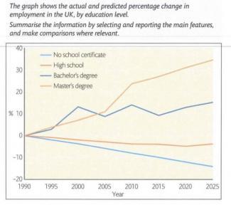
This
line graph illustrates the percentage Linking Words
change
between the actual and predicted amount of employment in the UK from 1990 to 2025.
Use synonyms
Overall
, the master's degree and non-certified schools show negative Linking Words
change
and high school and bachelor's degree holders show positive Use synonyms
change
by the end of 2025.
Use synonyms
According to
the line graph, the number of students who are qualified with a bachelor's degree rose by 10% in 2000, and it fluctuated until 2015, after it might increase by about 15% Linking Words
change
during ten years. Use synonyms
However
, the education level in high school gradually increased 10% gap till 2005 and it had increased rapidly to 25% within five years. Linking Words
In addition
, it will be increased to 35% in 2025.
Linking Words
Moreover
, the students with master's degrees do not much Linking Words
change
in all years it seems always the same amount. Despite the fact that most students got their school leaving certificate than predicted level and it approximately minors 15% Use synonyms
change
in 2025.Use synonyms