
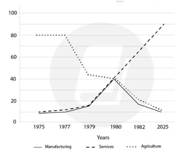
This
line chart illustrates the job trends in 3 different sections through the 50-year period. The units are in millions. Linking Words
Overall
, we can see that even though all 3 types of employment had different behaviours there was the same Linking Words
number
in 1980 at 40 Use synonyms
million
. Use synonyms
Also
, a Linking Words
number
of Services ended at a high rate.
For the Services job, there were the increased numbers from 10 Use synonyms
million
in 1975 to 40 Use synonyms
million
in 1980. The rate has been significantly increasing to 90 Use synonyms
million
in 2025. Use synonyms
Moreover
, despite facing the same behaviour as Services, the Manufacturing job rate sharply plumped to less than 20 Linking Words
million
and Use synonyms
then
steadily fell to 10 Linking Words
million
in 2025.
Use synonyms
Lastly
, for Agriculture, the Linking Words
number
stayed steady until 1977 at 80 Use synonyms
million
and dramatically dropped to 45 Use synonyms
million
in 1979. It met the same point at 40 Use synonyms
million
in 1980 Use synonyms
then
had decreased Linking Words
number
as Manufacturing at 10 Use synonyms
million
in 2025.Use synonyms