
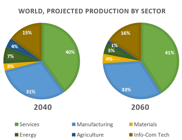
The two pie charts show the world's expected production by six different sectors in 2040 and 2060.
Overall
, Services will be the highest production in both years, 2040 and 2060 respectively. Linking Words
On the other hand
, agriculture will continue to decline by 2060.
Looking into more detail, comparing 2040 and 2060, it is believed there will be a slight growth in 4 of the 6 sectors. Linking Words
For instance
, the increase will be only one or two per cent in services, manufacturing, info-corn tech and materials than in 2040 with 41%, 33%, 16 and 4%. Linking Words
However
, Linking Words
according to
the charts, by 2060, fewer people will be interested in agriculture or energy as they have lost popularity and will end up in 1% and 5% in 2060. Linking Words
Therefore
, every 20 years it is projected to be aware of a moderate rise.Linking Words