
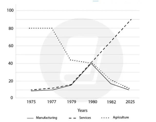
The given line chart illustrates information about employment in Manufacturing, Services, and Agriculture in the USA between 1975 and 2025.
Overall
, an upward trend was observed in the rate of employment in Services, Linking Words
while
the decline was experienced in Manufacturing and Agriculture.
In 1975, 10 Linking Words
million
people worked in Manufacturing and Services and the number of people working in these fields increased gradually and stayed at 40 Use synonyms
million
. Employees in Manufacturing went up 90 Use synonyms
million
, Use synonyms
however
, Linking Words
this
figure declined to 10 Linking Words
million
Use synonyms
at the end
of the period.
The proportion of workers in the Agricultural industry was at its highest peak (80 Linking Words
million
) at the beginning and Use synonyms
this
tailed off to around 40 Linking Words
million
in 1980, Use synonyms
this
kept going down till 2025 and stayed at 10 Linking Words
million
.Use synonyms