
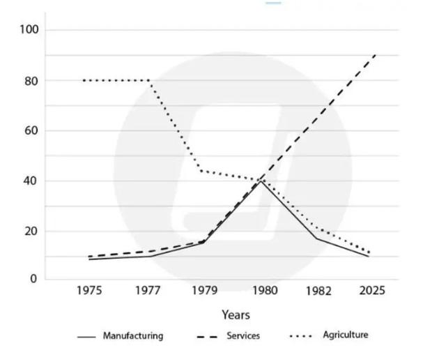
This
line graph provides information regarding how many people were employed in the USA.
Linking Words
Overall
, all factors are in the decreasing trend except for services which soared exponentially in 1979 and is predicted to still increase by 2025, occupying the first place.
In detail, the figure which showed the most notable change is agriculture. In 1975, most people were employed in the agriculture field, Linking Words
however
, the employment rate stayed at 80%, it declined drastically from 199. After Linking Words
Linking Words
then
, the change was more stable, but it was still declining Correct your spelling
that
untill
2025 by around 10%. In the case of manufacturing, it picked at 40% in 1980, following the number of Correct your spelling
until
the
Correct article usage
apply
survice
employment, and it went down Correct your spelling
service
agian
, which has Correct your spelling
again
similar
portion to agriculture, 10%.Add an article
a similar