
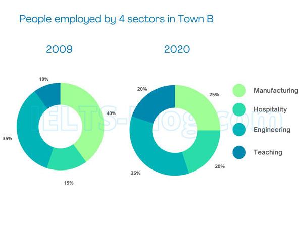
The charts illustrate the proportion of the work population in town A, divided into several sectors of the profession, namely manufacturing, hospitality, engineering, and teaching. These diagrams
also
differentiate into two separate times, in 2009 and 2020. Linking Words
Overall
, there was a notable highlight regarding workers shifting from being an engineer in 2009 to manufacturing sectors eleven years later.
In the year 2009, the majority of the population in city A was employed as an engineering staff. Only one-fifth of the individuals worked as a technician in factories, and the rest of them chose service (11%) and education (9%) as their primary source of income.
Linking Words
Conversely
, in 2020, manufacturing jobs dominated the markets of professions by almost two-thirds of the total population. Engineer personnel shrunk massively to less than 20%, Linking Words
while
hospitality occupations rose slightly by 15%. There was no significant change happened with the teaching sections, with only a decrease of 1% in eleven years’ time.Linking Words