
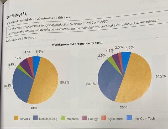
The pie chart describes the percentage of worldwide output by industry from 2040 to 2060.
As can be clearly seen from the graph, the six projected productions by industry experienced different trends. In all the sectors, the quantity of services was the highest over time.
As the graph shows, the prediction is 40% of the total expenditure on services in 2040,
while
the proportions will be slightly increased for services in 2060 at 41%. Linking Words
However
, in terms of manufacturing, the forecast shows it will account for 31% in 2040, compared with 31% in 2060.
Linking Words
By contrast
, the figures for the number of materials expected for 2040 and 2060 are only 3% and 4%, respectively. Energy is estimated to account for 7% of the total in 2040, and forecasts show a decrease of 5% in 2060. The tally of agriculture predicted is 4% in 2040, Linking Words
while
the proportions were lower in 2060 at 1%. Linking Words
Nevertheless
, the number of info-com tech anticipated in 2040 spent 15%, and the total of will witness went up slowly, accounting for 16% in 2060.Linking Words