
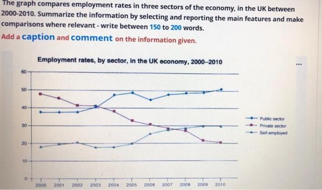
The line graphs illustrate the ratio of workers by sector in the UK from 2000 to 2010.
Overall
, it can be seen that public was the dominant area with the highest percentage, Linking Words
while
private and self-employed had similar levels.
Public companies started with around 38 in 2000. It remained steady until 2002 and three years later continuously increased between 40 to 50. Unfortunately, in 2006 the number of employees had declined by about 45. Linking Words
Then
, the trends climbed to above 50 from 2007 to 2010.
Linking Words
In contrast
, the private was leading at almost 50% Linking Words
initially
. It reached the same level with the public in 2003, Linking Words
then
it has plunged to 20% until 2010. Linking Words
Furthermore
, people who owned businesses grew considerably between under 20 and around 28 in 2007 and 2008, which is similar Linking Words
with
the private's point. Two years later it increased to 30 Change preposition
to
at the end
of the period.Linking Words