
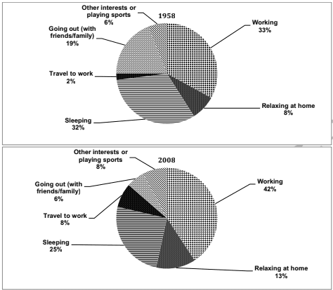
The provided chart indicates the ratio of adults from different countries spending their time on different activities in 1958 and 2008. Particularly in 1958,
due to
poverty ratio of adults working was 33% greater than the 32% of people who adopted sleeping.Only 2% of adults travel to work Linking Words
while
8% of man ratio keep relaxing at home. Curricular activities like going out with friends or family were fashioned about 19% more than other interests or sports which were 6% only.
Linking Words
On the other hand
, in the year 2008 people tended to work more which affects its percentage to 42% which is greater than in 1958, going out with family or friends and sleeping decreased to 6% and 25% respectively, Linking Words
moreover
, the proportion of relaxing at home Linking Words
hence
improved to 13%. 8% of the community travels to work, Linking Words
furthermore
, other interests or playing sports got more enhanced to 8% than from the year 1958.Linking Words