
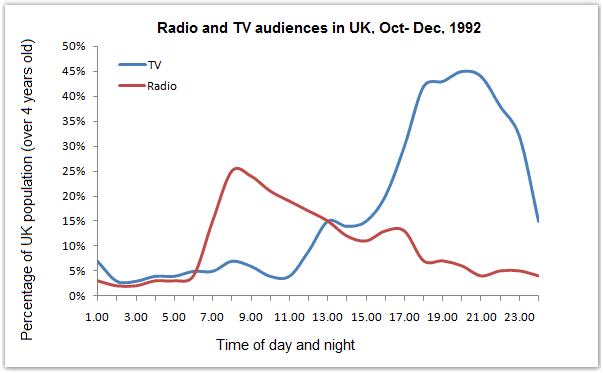
The line graph depicts the proportions of viewers in the UK between two groups
radio
and TV compared with time of day and night from October to December 1992.
Use synonyms
Overall
, it can be seen that the trend of TV was significantly increased Linking Words
whereas
Linking Words
radio
was steadily declining.
From the TV information apparent proportions started at 7% at 1.00 A.Use synonyms
M
. In the next few hours was moderately decreased to 3% at 7 A.Use synonyms
M
. and went down again to 2 % at 11.00 A.Use synonyms
M
. Use synonyms
Moreover
, the percentage rose to the peak at approximately 45% at 21.00 P.Linking Words
M
. Use synonyms
Although
in the Linking Words
last
hour of the day reduced to 15%.
On the one hand, Linking Words
Radio
illustrates started from 4% at 1.00 A.Use synonyms
M
and rose to peak at 25% at 9.00 A.Use synonyms
M
. After that a fluctuated gradually dropped to 10 % at 15 P.Use synonyms
M
. Use synonyms
However
, in the final hour of the Linking Words
radio
broadcast was approximately 3% of the UK population.Use synonyms