
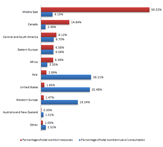
The chart below shows the percentage of total
world
Use synonyms
oil
Use synonyms
Use synonyms
ressources
and the amount of Correct your spelling
resources
waste
compared to the consumption in the Use synonyms
world
annually.
Use synonyms
Overall
, there are five areas where the percentage of total Linking Words
world
Use synonyms
Use synonyms
ressources
is slightly superior, except Correct your spelling
resources
from
Middle East, over the Change preposition
for the
five
Correct word choice
remaining five
restant
countries Correct word choice
apply
which
Punctuation problem
, which
are
though Punctuation problem
are,
principally
superior in the representation of total Punctuation problem
, principally
world
annual Use synonyms
oil
use.
Use synonyms
Middle
East is Correct article usage
The Middle
farly
the most Correct your spelling
fairly
influent
zone with the Correct your spelling
influential
higher
amount of Correct word choice
highest
oil
Use synonyms
Use synonyms
ressources
reaching slightly over 55%. Correct your spelling
resources
However
, its consumption is only about an approximatively 6%. Following Linking Words
by far
Middle East, Canada is the second best producer of Correct determiner usage
the
oil
, representing Use synonyms
pratically
a 15%. Correct your spelling
practically
Moreover
, Central and South Africa, Eastern Europe and Africa, Linking Words
are
all Verb problem
apply
around
a 7% for the global Verb problem
have around
explotation
, and around the 5% for Correct your spelling
exploitation
its
Fix the agreement mistake
their
waste
.
Asia, Use synonyms
United
States and Western Europe are very inferior in the production of Correct article usage
the United
oil
, all of them having only a 2% Use synonyms
Linking Words
while
they are the main zones where Punctuation problem
, while
oil
is Use synonyms
Use synonyms
waste
, being at around a 22%. Australia, New Zealand and the rest of Wrong verb form
wasted
places
in the Correct article usage
the places
world
are Use synonyms
farly
less producers and users of Rephrase
far
oil
. They both have around a 1% of the global Use synonyms
Use synonyms
ressources
and Correct your spelling
resources
waste
only a 1,5% of the Use synonyms
percentage of
total Check wording
apply
earth annual
Correct word order
annual oil consumption on Earth
oil
consumption.Use synonyms