
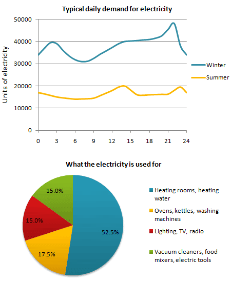
The line chart illustrates the typical daily demand for electricity in two seasons for a town in England,
while
the pie diagram displays the proportions of its utilization in households.
Linking Words
Overall
, Linking Words
it is clear that
people use more energy during the winter than during the summer, with the majority of the consumption coming from heating rooms and water.
Linking Words
According to
the first graph, the amount of power used by citizens in the winter ranged between 30,000 and 40,000, with a small spike of nearly 50,000 between days 21 and 24. Linking Words
However
, these numbers far outnumbered those in the summer, which hovered around 15,000 and 20,000 units.
Moving to the second graphic, 52% of residents consume electricity to warm up the space and water, which is by far the greatest allocation among others. Ovens, kettles, and washing machines are operated at 18%, Linking Words
whereas
lighting, TV, and radio are powered at 15%. Linking Words
This
figure is equal to those in vacuum cleaners, electric tools, and food mixers.Linking Words