
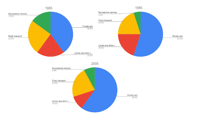
The charts display the percentage of four sorts of transportation means utilized in England in 1985, 1996 and 2005.
Overall
, it is evident that among all four types, private cars were recorded at the top of the list at all three given times. Linking Words
On the contrary
, recreational vehicles occupied the least usage.
Linking Words
To begin
with, the number of private cars used witnessed an increase. In the initial 20 years, it dramatically rocketed from 40% to 55%, followed by a slight rise to 65% in 2005. Linking Words
However
, lorries and other cars are used less as time goes by. In 1965 and 1985, the percentage of that type of vehicle stabilized at 20%, Linking Words
then
significantly plummeted to 10% in 2005.
Linking Words
Furthermore
, recreational vehicles and public transport share an identical trend, which is fluctuating. Between 1965 and 1985, their percentage of being used gradually fell, from 15% to 5% and 25% to 20%. respectively. In 2005, recreational vehicles climbed up to 8%, Linking Words
while
public transport slowly escalated to 22%.Linking Words