
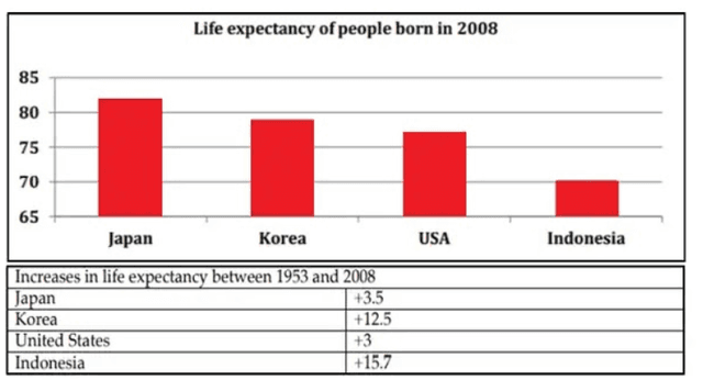
The bar chart illustrates data about how old people lived on average in four countries,namely
Japan
,Korea,the USA and İndonesia,Use synonyms
whereas
the pie chart compares rises in Linking Words
life
Use synonyms
expectancy
in the same countries as the former from 1953 to 2008.
Use synonyms
Overall
,what stands out from the charts is that people who lived in Linking Words
Japan
had the highest Use synonyms
life
Use synonyms
expectancy
.Use synonyms
Moreover
,the most considerable growth in the number of Linking Words
life
Use synonyms
expectancy
was seen in İndonesia.
Looking into detail,it is apparent that in Use synonyms
Japan
,citizens lived for 82 years on average and ranked first among the four countries.People who lived in Korea and the USA had almost the same Use synonyms
life
Use synonyms
expectancy
(approximately 75 years).Meanwhile,İndonesia citizens lived the least among the four counties with 70 years old on average.
With regard to the second chart,it is evident that the most significant rise was observed in Korea and İndonesia with 12.5 and 13.5 respectively.There was little difference in growth in average age in Use synonyms
Japan
and the USA,as the former increased by 3.5,the latter was lower by a narrow margin of 0.5Use synonyms