
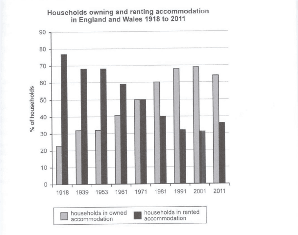
The bar graph illustrates the proportion of both accommodation owning and renting in Great Britain and Wales from the years 1918 to 2011.
According to
the figures, Linking Words
it is clear that
the trend of house owning and renting is reversed and there is a year that an individual demand is equal. Linking Words
However
, the trajectory seems coming back to Linking Words
the
same as in the early years.
On the one hand, owned accommodation started at nearly 23% in 1918 before increasing to well over 30% in the next year. It remained stable until 1953 and continuously rose to roughly 68% in 1991. Add a missing verb
be the
Additionally
, in 1971, it occupied 50% which was equal to the percentage of residents renting. A slight incline was seen in 2001 before decreasing to almost 65% in 2011.
Linking Words
On the other hand
, rented households began the period at approximately 77% and dropped to under 70% Linking Words
as well as
being hovered at Linking Words
this
point until 1953. After the year 1953, it steadily declined to 33% in 1991 and leveled off in 2001. Linking Words
Moreover
, a noticeable jump was seen in 2011, registered 36%.Linking Words