
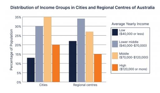
The provided bar chart presents the income levels of people who live in the
cities
and the regional Use synonyms
centres
of Australia.
Use synonyms
Overall
, the revenue amounts were categorised into four groups which were low (40,000 Linking Words
USD
or less), lower-middle (40,000-70,000 Use synonyms
USD
), middle (70,000-120,000 Use synonyms
USD
) and high (120,000 Use synonyms
USD
or more).
The top position in the Use synonyms
cities
was the middle-income Use synonyms
group
which contributed to approximately 35%, meanwhile, it was the second biggest portion at 27% in the regional Use synonyms
centres
. Use synonyms
In addition
, the lower-middle-income Linking Words
group
which had the highest percentage at 34% in the regional Use synonyms
centres
became second place at 30% in the Use synonyms
cities
. Use synonyms
Moreover
, the smallest Linking Words
group
in the Use synonyms
cities
was the low-income Use synonyms
group
at 12.5%. Use synonyms
On the other hand
, the high-income Linking Words
group
had the lowest percentage at 15% in the regional Use synonyms
centres
. There were significant differences in the structure of those areas. Use synonyms
However
, the lower-middle-income and middle-income were the main sectors totalling over 65%.Linking Words