
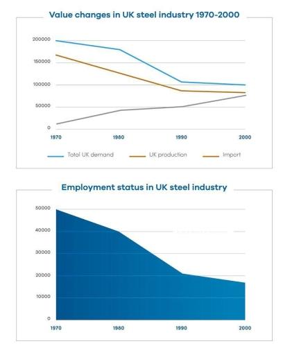
The graph line gives data on how the total demand, the production, the imports, and the employment status of the
steel
industry in the UK changed over a thirty-year period.
Use synonyms
Overall
, the four fields experienced different trends during the time period. Linking Words
While
the number of workers, the demand, and the production of Linking Words
steel
decreased with some fluctuations, the imports rose over time.
As the graph shows, the UK's Use synonyms
steel
demand figure started at 200 Use synonyms
thousand
Use synonyms
tons
in 1970, followed by a gradual decline to exactly 100 Use synonyms
thousand
Use synonyms
tons
in 2000. Regarding production, in 1970, 170 Use synonyms
thousand
Use synonyms
tons
of Use synonyms
steel
were manufactured. Use synonyms
This
figure went down to just under 100 Linking Words
thousand
Use synonyms
tons
in 2000. In terms of the quantity of people employed, it started at 50 Use synonyms
thousand
in 1970. Use synonyms
Then
, Linking Words
this
trend dropped dramatically to just above 20 Linking Words
thousand
in 1990 before witnessing a steady fall to about 18 Use synonyms
thousand
in 2000, respectively. Use synonyms
By contrast
, the Linking Words
steel
imports experienced a substantial growth from approximately 10 Use synonyms
thousand
to 75 Use synonyms
thousand
between 1970 and 2000.Use synonyms