
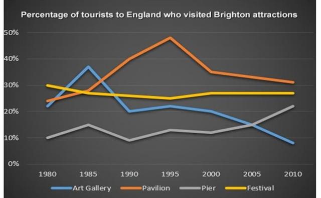
The line graph gives information about the rate of tourists to England who visited art galleries, pavilions , pier, and festivals in Brighton from 1980 to 2010 .
Overall
, it can be said that the percentage of visitors to the pier and pavilion grew over the period. Linking Words
while
art galleries and festivals were declined
It is interesting to notice that festivals had the highest number of visitors in 1980 with 30% Linking Words
then
it gradually decreased until 1995 to about 24% . In 1985 the art gallery peaked at approximately 38% Linking Words
then
they significantly fell in 1990 to 20% .
It can be easily seen that the pavilion had peaked at nearly 47% in 1995 Linking Words
then
it expropriated a downward trend until the end of the period. In 2010 pier had risen almost 22%Linking Words