The graphs below give information about computer ownership as a percentage of the population between 2002 and 2010, and by level of education for the years 2002 and 2010. Summarise the information by selecting and reporting the main features, and make comparisons where relevant. Write at least 150 words.

The graphs below give information about computer ownership as a percentage of the population between 2002 and 2010, and by level of education for the years 2002 and 2010.  Summarise the information by selecting and reporting the main features, and make comparisons where relevant. Write at least 150 words.
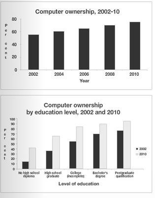
The percentage of computers owned by individuals every two years between 2002 and 2010, and
computer
ownership as a percentage by
level
Add an article
the level
show examples
of
education
in 2002 and 2010 are illustrated in the given graphs. Looking more closely at the graphs, it can be seen that the trend for individual
computer
ownership increased during
this
period.
Moreover
, in both years, the higher the level of
education
, the more likely people were to own a
computer
. The figures for having an individual
computer
steadily increased from around 50% in 2002 to 75 per cent in 2010. With regards to
education
levels, it is noticeable that the figures for college, Bachelor's degree and
postgraduate
Add an article
a postgraduate
show examples
qualification in 2002 saw more than 50
percent
Change the spelling
per cent
show examples
,
while
, in 2010, they showed more than 75%.
Furthermore
, in both 2002 and 2010, the lower
education
levels saw less than 50
percent
Change the spelling
per cent
show examples
of
computer
ownership, except for high school graduates in 2010 as by that year more than 50
percent
Change the spelling
per cent
show examples
of them had a
computer
.
Submitted by unnop_0007 on

Unauthorized use and/or duplication of this material without express and written permission from this site’s author and/or owner is strictly prohibited. Excerpts and links may be used, provided that full and clear credit is given to Writing9 with appropriate and specific direction to the original content.

Introduction: The introduction is missing.
Introduction: The chart intro is missing.
Vocabulary: Rephrase your introduction. Words match: 67%.
Vocabulary: Replace the words computer, education with synonyms.
Vocabulary: The word "graphs" was used 2 times.
Vocabulary: The word "figures" was used 2 times.
Vocabulary: The word "percentage" was used 2 times.
Vocabulary: The word "increased" was used 2 times.
What to do next:
Look at other essays: