
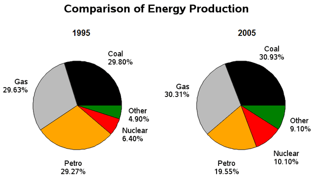
The given pie charts illustrate the consumption of
energy
from various sources in the UK in the year 2000 and 2010.
Use synonyms
Overall
, it is clear from the charts that coal and Linking Words
gas
were the main two sources of Use synonyms
energy
, Use synonyms
while
solar and other kinds of fuel were the least amount of Linking Words
energy
consumed over the period shown in the pie charts.
In 2000, it is noticeable that the proportion of Use synonyms
energy
usage from coal was the highest of all categories at 30.0%, followed by Use synonyms
gas
and petrol, with the figure being 29.5% and 29.0% respectively. The rest was shared on solar at 6.5% and other types of Use synonyms
energy
at 5.0%.
In 2010, it is apparent that there was a gradual increase in the consumption of coal, Use synonyms
gas
, solar and other Use synonyms
energy
in the UK. The use of coal was responsible for 31.0%, come after by 30.0% of Use synonyms
gas
, 10.0% of solar and 9.0% of other Use synonyms
energy
. Use synonyms
In contrast
, the use of petrol had decreased to 20.0%.
Linking Words
To conclude
, there was a slight change in the proportion of Linking Words
energy
consumption in the UK over a 10-year period.Use synonyms