
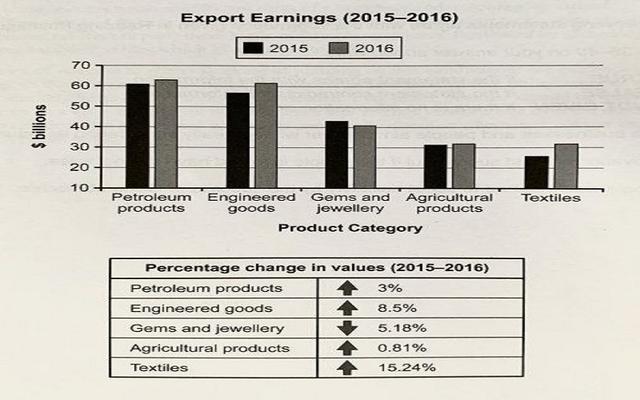
The chart depicts the values of several types of products through one country's exportation and the table contain the different values in rate in the year 2015 and 2016.
Overall
, petroleum goods were at the peak as compared to the rest of the brand and define the product growth in billions . All categories of output had different percentages of values.
Petroleum was the highest of all categories. It was around 60 billion in the year 2015, Linking Words
whereas
, In 2016 it was slightly over. Engineering goods and gems and jewellery had fluctuations in both years. Linking Words
On the other hand
, agriculture remained the same in 2015 and 2016. Linking Words
However
, textile was at the lowest.
In the second table, textile products value tremendously changed, it was at skyrocketed by 15.24%. It had only o.81%. Engineering goods were the second highest percentage in the table with 8.5%. Linking Words
On the other hand
, agriculture faced lowered trend.Linking Words
However
, petroleum products significantly decreased.Linking Words