
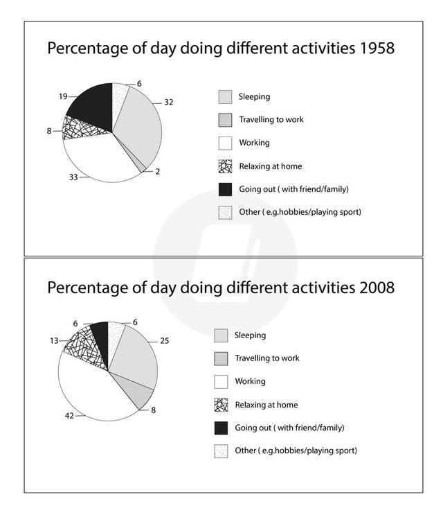
This
report illustrates a pie chart depicting how employed individuals in a country spent their Linking Words
time
across six different activities in the years 1958 and 2008.
Use synonyms
Overall
, in the year 1958, the least Linking Words
time
was spent on travelling to work Use synonyms
while
in 2008, going out with friends and family was the least practised activity. In terms of majority Linking Words
time
spent, in both 1958 and 2008, adults spent most of their Use synonyms
time
working.
The percentage of Use synonyms
time
spent going out with friends and family reduced by thirteen per Use synonyms
cent
from 1958 to six per Use synonyms
cent
in 2008. Use synonyms
Similarly
, the proportion of Linking Words
time
spent on sleep in 1958 was seven per Use synonyms
cent
more than that of 2008's twenty-five per Use synonyms
cent
Use synonyms
.
The duration spent on work, Change preposition
in.
however
, increased in 2008 by nine per Linking Words
cent
from 1958 to forty-two per Use synonyms
cent
. Use synonyms
Likewise
, in 2008, there was an increase of five per Linking Words
cent
dedicated to hours relaxing at home in 1958 when only eight per Use synonyms
cent
of the Use synonyms
time
was spent on that. Use synonyms
Lastly
, from 1958 to 2008 there was Linking Words
also
an increase in travel to work from two per Linking Words
cent
.Use synonyms