
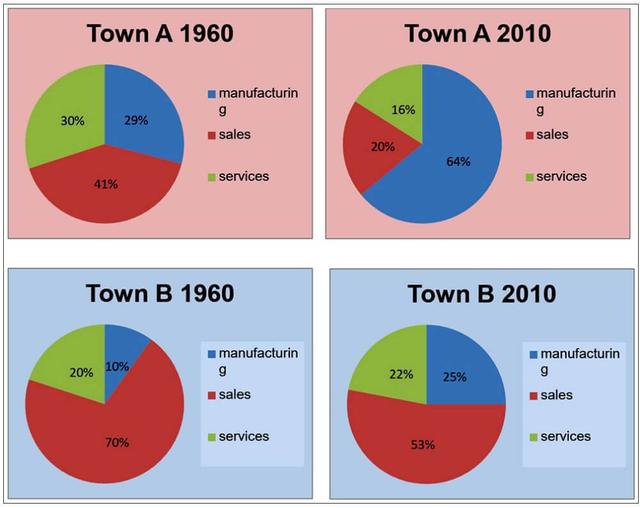
The pie graphs provide information on the percentage of employees in two towns over a 50-year period of time based on 3 various sections.
In town A,
number
of employees in Manufacturing and sales decreased significantly by reducing in half in 2010 compared to the 1960 data Correct article usage
the number
whereas
an opposite trend can be observed in services with an increment of more than 30%.
Linking Words
In contrast
, town B shows a similar trend when it comes to Linking Words
the
Correct article usage
apply
manufacturing related
jobs but the gap is less around Add a hyphen
manufacturing-related
18
% reduction in 2010 compared to 50 years earlier Correct article usage
an 18
while
in town A, the gap Linking Words
is
nearly declined Unnecessary verb
apply
in
half in 2010 than before.
Even though in 1960, both towns showed a similar change by achieving the largest portion in manufacturing, Change preposition
apply
but
in 2010 the largest portions were Correct word choice
apply
aquired
by Correct your spelling
acquired
team
A & B by services and manufacturing.Fix the agreement mistake
teams