
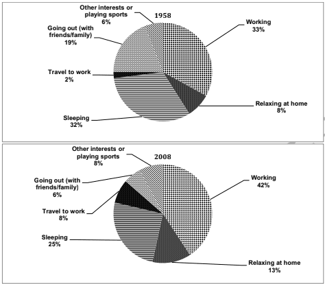
Information is presented in two pie charts which compare the amount of
time
, in percentage, that employees spent on six different activities in a country between 1958 and 2008.
Use synonyms
Overall
, it can be clearly seen that Linking Words
while
each Linking Words
activity
that working adults did Use synonyms
experienced
a wide variety of changes, working and sleeping were the most and the second most popular categories in both years respectively. Change the verb form
experience
In addition
, the most significant change in employees’ Linking Words
behavior
was travelling to work.
Turning to Change the spelling
behaviour
first
main feature, working ranked first in Add an article
the first
activity
that working adults spent their Use synonyms
time
on over the survey period, contributing to 33% in 1958 and 42% in 2008. Use synonyms
Next,
sleeping ranked second in the Linking Words
activity
that employees did. In 1958 the amount of Use synonyms
time
that employees slept was Use synonyms
an
Correct article usage
apply
exact
32%, before decreasing slightly to a precise 25% in 2008.
Turning to another main feature, with respect to going out, the popularity of Change the word
exactly
this
Linking Words
activity
decreased noticeably from a modest 19% in 1958 to only 6% in 2008. Use synonyms
Nevertheless
, there was Linking Words
also
an increase of 5% in relaxing at home. In 1958 only 8% of working adults spent their Linking Words
time
on Use synonyms
this
Linking Words
activity
. After Use synonyms
that
the popularity of Add a comma
,that
this
Linking Words
activity
rose to a modest 13% in 2008. The Use synonyms
last
key point to note is travelling to work which rose fourfold from a precise 2% in 1958 to an exact 8% in 2008.Linking Words