
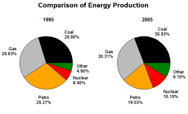
The pie charts represent the comparison of various kinds of energy consumption in the UK in two years.
Overall
, coal had the highest usage.
Linking Words
Firstly
, in 1995, usage of coal stood at 29.80%, 29.63% for gas and 29.27% for petrol. Apart from petrol, values for the other two rose in 2005 and closed at 30.93% for carbon compounds, 30.31% for gas and 19.55% for fossil fuel. Collectively, these 3 had the highest share.
Linking Words
Lastly
, for the case of the remaining fragment, the nuclear utility was at 6.40% for 1995 and increased to 10.10% after 10 years and Linking Words
finally
the other types of sources ranged in the bracket of 4.90% in the previous year chart which climbed to 9.10% in the after.Linking Words