
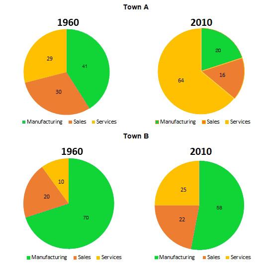
The charts illustrate information about changes in job parts in two different towns.
Overall
, Linking Words
chart
of city A displays that service after a Correct article usage
the chart
while
increased considerably. Linking Words
Whereas
in town B Manufacturing gradually decreased.
Linking Words
It is clear that
in town Linking Words
A
smallest minority of the total was services in 1960 (29). After Change the article
The
50-year
period Add an article
a 50-year
this
Linking Words
part
by far serged to 64 in 2010. By applying contrast, the biggest Use synonyms
part
in 1960 was Manufacturing (41). Use synonyms
While
Linking Words
at the end
of Linking Words
a
period in question 2010 decreased to 20.
On the other town B smallest Correct article usage
the
part
in 1960 was servicing it occupy 10, Use synonyms
however
after a Linking Words
while
decreased considerably to 20. Linking Words
In
Linking Words
contrast
Manufacturing in 1960 was Add a comma
,contrast
biggest
Change the article
the biggest
part
of the total it occupy 70, Use synonyms
while
declined by 58 Linking Words
at the end
of Linking Words
period
in question.Add an article
the period
a period