
Firstly
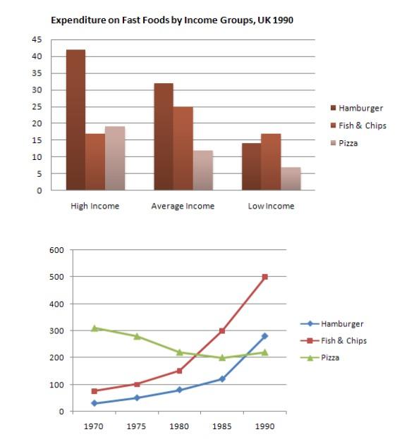
, The bar chart depicts how much a person with low income, average income, and high income in Britain spent per week on 3 different fast foods in the year 1990, whilst the line graph displays the consumption of these foods between 1970 and 1990.
Linking Words
Secondly
, it can be seen that wealthy people spent and ate more than the other two lower categories.
Linking Words
Thirdly
, regarding expenditure, the highest one, of 45 pence per week, was that on hamburgers made by high-compensation people, just followed by those with an average revenue that just spent around 12 pounce less than them. Fish & chips were the least preferred by the rich community and the most bought by the population with a low profit who spent just over 15 pence per week per person.
All in all, in terms of grams consumption per person, pizza and hamburgers witnessed a similar upward trend until 1980, the eating of hamburgers jumped, leading, in 1990, to more than triple the 1980 consumption, Linking Words
while
pizza spiked only from 1985.Linking Words