
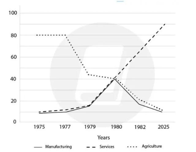
The given line chart illustrates the number of employees in 3 different jobs which are manufacturing, services and agriculture in the USA from 1975 to the present and
also
predicts the trend till 2025.
Linking Words
Overall
, there is a noticeable fall in the number of farmers through these 45 Linking Words
years
. Use synonyms
In contrast
, services increased sharply and it is predicted to have the same behaviour for the next Linking Words
years
.
Use synonyms
According to
the chart, cultivation was the most popular job in 1975 and 80 Linking Words
million
people in the USA were farmers which was 8 times more than the other jobs’ employments. Use synonyms
Although
Linking Words
this
job was popular for individuals for the following 2 Linking Words
years
, it experienced a dramatic drop to 40 Use synonyms
million
by 1980. The same trend continued till now and it is predicted that it will decline to the region of 10 Use synonyms
million
employees in 2025.
Use synonyms
However
cultivation lost its popularity among people, services noticed a significant rise during these reported times and it is considered that it will reach 90 Linking Words
million
in 2025. Use synonyms
Moreover
, a fluctuation can be seen in manufacturing starting from the same figure as agriculture, reaching its peak which was 40 Linking Words
million
in 1980 and a steep drop for the following Use synonyms
years
to its initial point.Use synonyms