
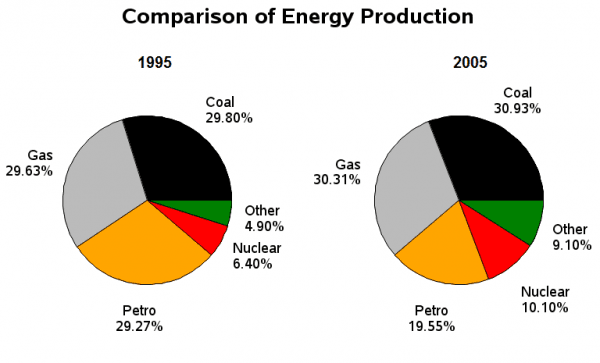
The given pie charts illustrate the shifts in the ratio of
energy
produced by France in 1995 and 2005. Use synonyms
Overall
, there are five sources of Linking Words
energy
and in both years, the production was dominated by coal, gas, and petrol.
Use synonyms
To begin
with, in 1995, the biggest contributors were coal, gas, and petrol which showed approximately 29%. Linking Words
Subsequently
, the three of them made up almost 90% of the Linking Words
energy
in the whole country. Meanwhile, nuclear and other sources of power covered up the remaining 10% by giving 6.40% and 4.90% respectively.
Ten years later, in 2025, the same three sectors still supplied the most Use synonyms
energy
in France. Use synonyms
However
, there were changes in the proportion. Coal and gas both went up to around 30%, Linking Words
whereas
petrol fell dramatically to just under 20%. Linking Words
On the other hand
, both nuclear and other sources of power increased significantly by about 4%.Linking Words