
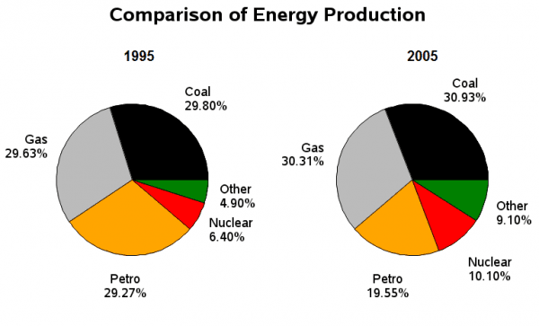
The provided pie chart illustrates the visual representation of
energy
types produced in France in two years, 1995 and 2005.
Use synonyms
Overall
, Coal is the most produced one in both two years, Linking Words
in contrast
, other kinds of Linking Words
energy
which are not mentioned by their names take the least piece from the pie.
For talking about a decrease, as seen from the chart, only one type of Use synonyms
energy
witnessed a fall. Use synonyms
This
is Petrol which became 19.55% in 2005, Linking Words
while
it was one of the backbones in 1995 with 29.27%.
Coming to growth, the slices of Gas and Coal witnessed a very slight increase by 1% merely, and Linking Words
become
30.31% and 30.92% respectively in 2005. Contrarily, the production of Nuclear and other kinds of Wrong verb form
became
energy
have Use synonyms
significant rise
percentage-wise: Replace the word
significantly risen
portion
of Nuclear Add an article
a portion
the portion
energy
rose from 6.4% to approximately one-tenth of the pie, and other types of Use synonyms
energy
almost doubled(4.9% in 1995, and 9.1% in 2005).Use synonyms