
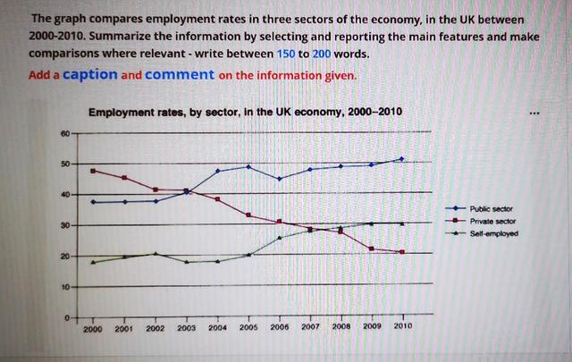
The graph highlights data about employment rates in three sectors of the economy, in the UK, over a ten-year period between 2000 and 2010.
Overall
, what stands out from the graph is that There are upward trends in both self-employment and Linking Words
public
Correct article usage
the public
sector
. Use synonyms
However
, Linking Words
private
Add an article
the private
sector
experienced a gradual decrease Use synonyms
through out
the period. Another interesting fact is that Correct your spelling
throughout
public
Correct article usage
the public
sector
was the most popular one for many Use synonyms
years
.
Looking at the details, regarding Use synonyms
public
Add an article
the public
sector
, it started at approximately 38 per centUse synonyms
,
and Remove the comma
apply
then
remained stable for 2 Linking Words
years
. Having increased rapidly to nearly %50 by 2005, it Use synonyms
then
saw fluctuation between %45 and %50 for the following four Linking Words
years
. Use synonyms
Then
it rose negligibly to just over %50. As regards self-employment, it began at around %18 and Linking Words
then
rose to 20 per cent. Linking Words
Then
it decreasedLinking Words
,
but got recovered by 2005. Remove the comma
apply
Next,
it saw a rapid increase in four Linking Words
years
to just %30 and remained stable until 2010.
Looking at the private Use synonyms
sector
, it witnessed a gradual fall in the first three Use synonyms
years
to around %40 by 2003, which was the most popular one compared with others. After Use synonyms
that
it fell rapidly to just under %30 by 2008, after which it decreased dramatically to around %20 by 2010, which was the least-wanted Add a comma
that,
sector
.Use synonyms