
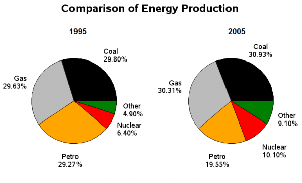
The two pie charts highlight data about several types of energy production which were consumed in 1995 and 2005 in France.
Looking from an
overall
perspective, it can be clearly seen that the consumption of various kinds of energy saw a significant increase, Linking Words
whereas
the reverse was true for petroleum. The interesting point is that coal and gas made up approximately Linking Words
a
half of the total proportion.
As regards gas which was the highest proportion in the given period, it accounted for 29.63% and 30.31%, in 1995 and 2005 respectively. Coal made up 29.80% in 1995, which was a little bit lower than that in 2005 (30.93%). As for petroleum, it was nearly a third in 1995 but in 2005, it dropped to 19.55%.
Correct article usage
apply
In contrast
, nuclear which was ranked fourth made up just 6.40% in 1995, Linking Words
while
it rose to 10.10% in 2005. Linking Words
Finally
, other sources of energy which Linking Words
was
accounted for the least during a decade was the smallest percentage of 4.90 in 1990 and 9.10 in 2005.Unnecessary verb
apply