
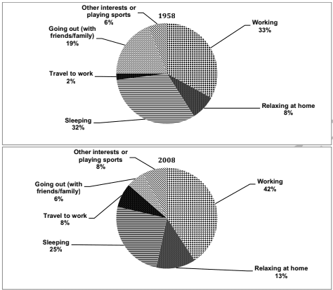
The charts demonstrate the proportion of
time
consumed by workers on various activities in one country between 1958 and 2008.
Use synonyms
Overall
, Linking Words
according
Linking Words
to
the pie charts in both years , show Change preposition
apply
a
largest percentage Change the article
the
in
Change preposition
for
the
relaxing hours at home and working hours.Correct article usage
apply
In contrast
, Linking Words
lowest
level Add an article
the lowest
in
sleeping and spending Correct your spelling
is
time
with family or friends.
Regarding the pie charts in 1958 and 2008, the work represents the highest percentage (33% and 42%) , respectively . Use synonyms
This
is followed by sleeping forms ( 32% and 25%).
Linking Words
While
Linking Words
,
the Remove the comma
apply
time
spent with family or friends demonstrated 19% in 1958 compared to 2008 was dramatically decreased to only 6%.
Use synonyms
Similarly
, the Linking Words
time
of chill at home in 1958 was 8% Use synonyms
whereas
in 2008 rose sharply to 13%.
Linking Words
Moreover
, Linking Words
spent
Wrong verb form
spending
time
on other activities Use synonyms
such
as travel to work slightly Linking Words
rise
from 2% in 1958 to 8% in 2008.
Wrong verb form
rose
In addition
, the playing sports was no significant change between 1958 and 2008.Linking Words