You should spend about 20 minutes on this task. The line graph shows the percentages of Australian export with four countries. The graph below shows the percentage of Australian exports to 4 countries from 1990 to 2012 You should write at least 150 words.

You should spend about 20 minutes on this task.

The line graph shows the percentages of Australian export with four countries.

The graph below shows the percentage of Australian exports to 4 countries from 1990 to 2012

You should write at least 150 words.
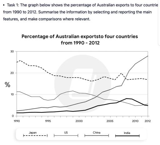
The line graph illustrates the proportion of trading activities from Australia to four countries (Japan, the US, China and
India
) between 1990 and 2012.
Overall
, China experienced a significant increase in portion
as well as
India
even with a decent move up
while
Japan and the US show a contrary trend. Shipping to China and
India
started with a small allocation which less than 5% in 1990
however
, the quantity rose substantially from 5% in 2000 to more than 25% before 2010.
Similarly
, freight distribution to
India
reveals expanded capacity from below 5% in 2000 to nearly 10% in 2010.
Difference
Add an article
The difference
show examples
with other two countries, Japan who led the export portion in 1990 with more than 25% has declined to less than 20% in 2012.
In addition
, the US shows a deterioration trend from more than 10% in 1990 to just slightly above 5% in 2012
Submitted by ikramjeihan.bnc on

Unauthorized use and/or duplication of this material without express and written permission from this site’s author and/or owner is strictly prohibited. Excerpts and links may be used, provided that full and clear credit is given to Writing9 with appropriate and specific direction to the original content.

Sentences: Add more complex sentences.
Common mistake: Your writing should be 150-250 words.
Vocabulary: Replace the words india with synonyms.
Vocabulary: The word "show" was used 2 times.
Vocabulary: The word "trend" was used 2 times.
What to do next:
Look at other essays: